I don’t know UIs, but I know what I like…
Monday, November 24, 2003
The user in me sees Longhorn and dreams of software without limits. The engineer in me sees Longhorn and is scared of software without limits. An engineer’s days are defined by requirements and restrictions. Those restrictions come not only from the capabilities of the tools and technologies being bolted together, but also accepted practice. For years, I’ve been comfortable designing “rich” client applications because a) my tools and technologies haven’t let me do much that was really “rich” and b) because “rich” was pre-defined by existing applications.
In fact, when I started programming Windows 3.1, I adopted a single 3-step UI design process:
- Figure out the the requirements of the particular UI doodad I needed
- Find my favorite example of it in Visual Studio, Word or Outlook
- Make User/MFC/WTL/WinForms do that
It doesn’t take much to design an application that looks like this:

or even one that looks like this:
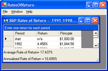
when the process is merely aping existing apps. I was even encouraged to use this kind of UI design by books with color pictures from well respected authors:
When the web came along, things were scary because all the guidelines were gone. However, at first the limitations were strict, so I didn’t have any trouble building sites that looked like this:

but when a few years later, the limitations faded away and I was expected to conceive of and implement stuff like this:
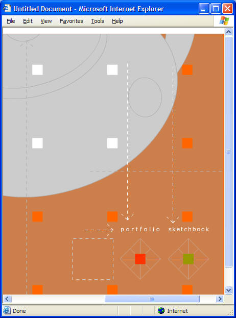
I didn’t have a clue. Luckily, the web “way” settled down over the years so that we figured out basically how to design web sites:
Plus, limitations took hold as we realized that you could build pretty much anything you wanted unless you wanted it to work on someone’s machine besides yours, which turned the screws down pretty tightly.
Still, while the emerging conventions helped me figure out what I wanted my own web site to look like in general, I had to *pay* for help from a otherly-skilled professional before I could get the specifics:
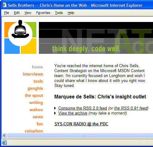
This is where it got scary until I had the one application designed for which I would ever need a designer. With my web site out of the way, it was smooth sailing.
That is, until Longhorn and Avalon came along.
Avalon drops the bottom out of the limitations and the guidelines again, leaving guys like me in a lurch. Oh sure, I’ve done pretty much everything there is to do in this industry, from coder to President, from docs to QA, from project management to *shudder* marketing. However, what I haven’t done and always hoped to avoid was design the graphics that go along with an application. Those were always things that I could hire done, most often as a deductible expense.
But now what do I do? MS doesn’t provide MSDN authors a “graphic artist” budget. We do have very talented graphic artists at MSDN, but what’s my boss going to say when they’re swamped doing graphics for my pet projects and not the public-facing web site?
And standard bitmap graphic artifacts aren’t enough; I need *vector* graphics. Even I can see that while this is fine:
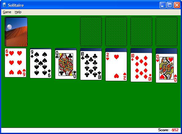
nobody is expanding sol.exe’s main window to get more “green space”:
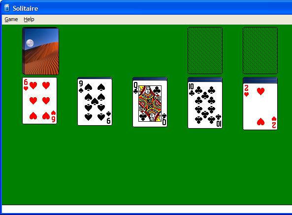
To solve problems like these, we need vector graphics that look good when they’re scaled, which I understand is roughly 10x harder than bitmaps (which are already beyond me).
But just the graphics aren’t enough, either. MS is busy redesigning the Windows “user experience” to include the best of Windows and the web:

Apps are supposed to behavior sensibly (which I can handle) *and* look cool (where do I learn to make *that* happen?!?).
In fact, taking the next step from the budding UX guidelines, we seem to be heading into a place where if I want to build my own sol to fix the scaling, I’ll be trying to fit a “menu system” on the front like the gaming guys do:

and like so:
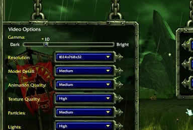
In fact, I’ve heard tell that there’s a special guy that designs these pre-game antics separately from the rest of the game just so folks think the game is cool as soon as it starts, long before you’re actually playing it. How can I stand up to that kind of pressure? I was pretty damn happy with myself when I made blocks fall and stack:
And while this is the only scalable game of its kind of which I know (I was ready for Avalon a while ago, apparently : ), it still has the standard un-cool “menu system” that Windows comes with out of the box.
And there’s no relief in sight! Avalon, by taking advantage of 3D hardware and displays that haven’t even been invented yet, along with intrinsic support for every kind of media and animation that I’m familiar with, blows right by the limitations we’ve grown to know and love in Windows and web applications. Now we’re into the world of game programmers, where if you can imagine it, you can do it.
But where am I going to get the graphics for what I can imagine?
How do I imagine a user experience when MS is literally still writing the book on it and they haven’t shipped a Longhorn Visual Studio, Word *or* Outlook?
Graphic/user experience designers of the world, please be gentle; the engineers are spooked and could stampede at any moment…
Know where I can get some graphics/user experience designers cheap?


