
Fun With GridView*RowPresenter
I was searching for advanced WPF tree samples the other day and ran into the tree-list-view sample:

Notice how the left-most column does the indenting, while the rest of the columns line up nicely. The code for the tree-view-sample is a little C# and a bunch of sophisticated XAML templates I didn’t understand, so I stripped it down to the bare nubbins to discover what was going on. Assume a simple class holding the data:
class Person {
  List<Person> children = new List<Person>();
  public string Name { get; set; }
  public int Age { get; set; }
  public List<Person> Children { get { return children; } }
}
The juicy bit that makes the tree-list view above possible is the GridViewRowPresenter:
<Window ...
  xmlns:local="clr-namespace:WpfApplication10"
  Title="GridView*RowPresenter Fun">

  <Window.DataContext>
    <local:Person Name="John" Age="13" />
  </Window.DataContext>

  <GridViewRowPresenter Content="{Binding}">
    <GridViewRowPresenter.Columns>
      <!-- NOTE: must explicitly create the collection -->
        <GridViewColumnCollection>
          <GridViewColumn Header="Name" DisplayMemberBinding="{Binding Name}" />
          <GridViewColumn Header="Age" DisplayMemberBinding="{Binding Age}" />
      </GridViewColumnCollection>
    </GridViewRowPresenter.Columns>
  </GridViewRowPresenter>

</Window>
Here, we’re creating an instance of the GridViewRowPresenter, which is the thing that the ListView creates for you if you use the GridView. Here, we’re using it explicitly and setting the columns explicitly, binding it to our data and yielding the following:
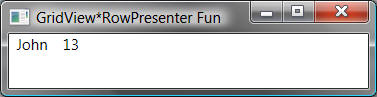
Notice that we’re showing a single item, arranged as a row of values according to our column definition above. It’s boring and not at all interactive, at least because we don’t have a header, which we can get with an instance of the GridViewHeaderRowPresenter:
<Window.Resources>
  <GridViewColumnCollection x:Key="columns">
    <GridViewColumn Header="Name" DisplayMemberBinding="{Binding Name}" />
    <GridViewColumn Header="Age" DisplayMemberBinding="{Binding Age}" />
  </GridViewColumnCollection>
</Window.Resources>

<StackPanel>
  <!-- NOTE: must share access to same column collection to get shared resizing -->
  <GridViewHeaderRowPresenter Columns="{StaticResource columns}" />
  <GridViewRowPresenter Content="{Binding}" Columns="{StaticResource columns}" />
</StackPanel>
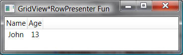
Here we’re creating an instance of the row presenter, passing in a reference to the same columns collection used by the row presenter so that the column sizes and positions are shared between the header row and the row presenters:
If we want more than one piece of data, all we have to do is use an items control with an item template that in turn creates a row presenter for each item in the collection:
<Window.DataContext>
  <x:Array Type="{x:Type local:Person}">
    <local:Person Name="John" Age="13" />
    <local:Person Name="Tom" Age="12" />
  </x:Array>
</Window.DataContext>

<Window.Resources>
  <GridViewColumnCollection x:Key="columns">
    <GridViewColumn Header="Name" DisplayMemberBinding="{Binding Name}" />
    <GridViewColumn Header="Age" DisplayMemberBinding="{Binding Age}" />
  </GridViewColumnCollection>
</Window.Resources>

<StackPanel>
  <GridViewHeaderRowPresenter Columns="{StaticResource columns}" />
  <ItemsControl ItemsSource="{Binding}">
    <ItemsControl.ItemTemplate>
      <DataTemplate>
        <GridViewRowPresenter Content="{Binding}" Columns="{StaticResource columns}" />
      </DataTemplate>
    </ItemsControl.ItemTemplate>
  </ItemsControl>
</StackPanel>
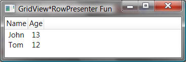
Now, we’ve got a stack panel that combines the header to the grid view rows with the grid view rows themselves, one per item in our collection:
Now on a rush of discovery and simplicity, I took the next step to show hierarchical data, hosting the data in a TreeView control and using a hierarchical data template so that I could build the tree list view shown above with the tiniest bit of XAML and code:
<Window.DataContext>
  <x:Array Type="{x:Type local:Person}">
  <local:Person Name="Chris" Age="38">
    <local:Person.Children>
      <local:Person Name="John" Age="13" />
      <local:Person Name="Tom" Age="12" />
    </local:Person.Children>
  </local:Person>
  <local:Person Name="Melissa" Age="39" />
  </x:Array>
</Window.DataContext>
...
<StackPanel>
  <GridViewHeaderRowPresenter Columns="{StaticResource columns}" />
  <TreeView ItemsSource="{Binding}" BorderThickness="0">
    <TreeView.ItemTemplate>
      <HierarchicalDataTemplate ItemsSource="{Binding Children}">
       <GridViewRowPresenter Content="{Binding}" Columns="{StaticResource columns}" />
      </HierarchicalDataTemplate>
    </TreeView.ItemTemplate>
  </TreeView>
</StackPanel>
Unfortunately, that’s where we run into the limit of what we can do without cranking things up a notch:
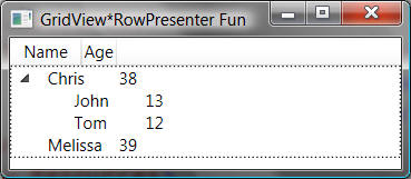
Beside the border around the tree view (caused by focus), the worst part about our simple tree-list-view is that, while each grid view row has the proper column sizes and relative positions, because the tree does the indenting, all of the columns are offset, not just the first one. The key to fixing this problem is to put the styling for indenting into the template for the first column only using the CellTemplate property of the GridViewRowColumn, taking over the drawing of the tree view items, which is what the tree-list-view sample does.